
We’ve been bad all season right? Worse than last season? In a relegation battle, I think we’d all agree.
But are we?
If you look at our league position this season, compared to last, over the first 23 games of each season, then things don’t seem quite so bad. And I’ve done just that and put it on a pretty graph.
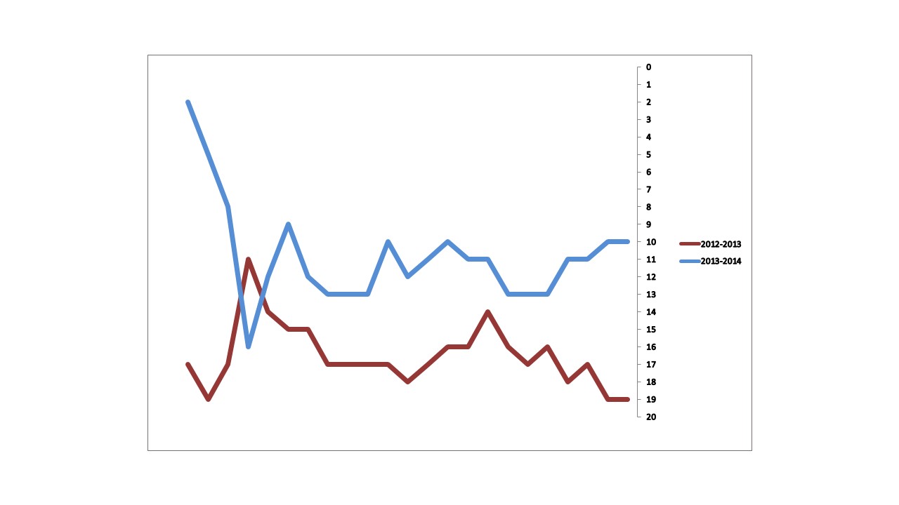
The blue shows this season, the claret line last season, and is for the first 23 games of each season, rough and tough, just over half the season.
So what does this really tell us?
a) I can’t make graphs correctly?
b) Everyone else is getting worse?
c) We’re getting better?
d) Hoof-ball is surprisingly effective?
e) You can make stats show anything?
f) Something else
The lowest we have been this season is 16th, compared to a pretty constant bump along the bottom last.
We haven’t even been in the bottom 3 on a single occasion, despite several visits last season. Our average league position over the first 23 games this season is 11th. The same calculation for last season puts us in an average position of 16th.
Now Randy is a business man, and likes stats, pure and cold without the emotion. If this was put on his desk on a weekly basis, he’d be quite likely to conclude that the approach that Paul Lambert is taking is working, and having the right effect. If you added a line to show the wage bill, I’m sure it would look even better.
Ok, so we are not mathematically safe, and a lot can happen in the remaining games. And I am not saying everything is rosy at Villa right now, and of course there has been some lows for sure, and the lack of clarity about where we are going is frustrating. There is also room for improvement, but then isn’t there always.
But based on the above graph, is it all as bad as we think, or have the stats shown us something different? Is this what a relegation battle looks like? I’m not so sure.